The Ever App
THE PROBLEM
When I joined Ever in October 2016, they were a fledgling startup with a rough app prototype. While it was functional, several key elements were missing:
- A smooth, logical, pleasant user experience
- Aesthetic appeal
- Clear visual language and visual brand definition
USERS
Ever is primarily focused on allowing users to discover the fashion, makeup, and actors/actresses, so the user base was primarily:
- Female
- 20s-50s
- Interested in fashion
- Regularly TV watcher
- Has disposable income
- Enjoys shopping
PERSONA
INITIAL RESEARCH
I started this project by interviewing the CEO and CPO of Ever about their vision of the app, in terms of functionalities, tone, brand identity, and user experience. We determined the necessary functions were:
- Pair: Linking your mobile device with a smart TV which plays Ever-enabled content
- Capture: The scene the user is interested in on TV appears on her phone, with the content (fashion, objects, makeup, people, places) listed below.
- Save: Save individual items or scenes to to view later, in case the user does not want to buy immediately.
- Shop: Purchase the items of interest
- View Trending: Certain scenes and items will be capture more frequently than others, and a section of the app will be devoted to that compilation. Users can browse and purchase what others find of interest.
USER FLOW
After brainstorming functions users might need, I created a user flow of screen pages and actions.
INSPIRATION UI
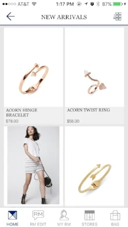
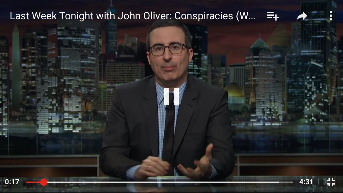
The Ever App is, UI-wise, a mash up of a shopping, image viewing & sharing, and video platform. Thus, I drew insights from other mobile apps with relevant challenges:
- YouTube
- Rebecca Minkoff & Neiman Marcus
IDEATION & CONCEPT GENERATION
After brainstorming all the app functionalities, I started sketching potential wireframes.
Questions I had to consider:
What is the best way for users to discover items of interest?
Does the value of in-app purchasing (rather than being redirected to the brand's browser shopping page) warrant the time-intensive build?
What should the first run experience look like?
What goes on the home screen?
TOOLS
Adobe Illustrator & Photoshop — screen design
InVision — user testing
USABILITY TESTING
After creating an initial prototype and refining it, I conducted user testing with individuals within the following demographic:
- Female
- 20s-50s
- Interested in fashion
- Regularly watch TV
My goals were to determine:
- What is valuable to the user?
- What’s working/not working?
- What do we need to think about or iterate more?
- Where’s the confusion?
Setting: home environment, couch with a TV.
RESULTS
Joan, 50s, retired
Findings:
- Skipped tutorial
- Problem interacting with screen: dots were too small (tried moving them),
- Didn’t understand the star icon for trending screens & items
- Wanted easy sharing, through in person, email, link in SMS
- Didn’t understand "saved" feature
Kathy, 24, recent college grad & nanny
Findings:
- Didn’t read the tutorial deeply
- Confused by numbers
- Wanted to see what was trending per category (e.g. trending tops, jackets, trousers, ...)
- Tapped star first in tab bar, thinks it’s what you like
- Used app like remote control, Tried tapping show name in “e enabled show”: expects it to show up on tv & phone
- Avoids logging in with Facebook
Caroline, 40s, owns a fashion boutique
Findings:
- Spent time on the tutorial
- Was interested in seeing what was trending
- Wanted easier sharing
USER TESTING SYNTHESIS
Main takeaways:
- Users want selective saving, the ability to save individual items rather than the whole frame
- The trending icon should be more clear, and we should add a bubble as an extension of the onboarding experience re-explaining "Trending"
- The frame & dot concept didn't work — users couldn't read the numbers (they were too small), dots covered items, people had very different expectations of how to interact with the dots (touch? move? zoom?), and couldn't establish correlation between number on frame and number on item list
- Make frames zoomable?
- Make numbers bigger?
- Make items tappable? Or a bubble establishing correspondence numbers on frame and in list
- Capture: users forgot the function of the "E" button, another explanatory button "Captures next screen" wanted ability to rewind
ELIMINATING THE DOTS
In addition to fashion, objects, and places, after talks with a few TV channels, we determined there was an also in interest among viewers to discover the actresses and beauty products in their TV shows. If we maintained the existing visual tagging system, we would be tagging the people and mascara/blush/lipstick/etc. visible in screens, and thus be overlaying faces with orange numbered dots, which would be dehumanizing and cluttering.
It was very important that the actors and their bodies not feel like objects to be purchased, so we decided not to use orange dots for them. To maintain a consistent discovery experience – and avoid a dissonance where different categories are found through different means (objects through tapping dots, people and beauty through scrolling beneath the captured frame) – we decided to eliminate the orange dots altogether.
APP SCREENS
ONBOARDING
- Screen 1: Prompts user to play ever-enabled content and pair their devices
- Screen 2: Explains how the capture "e" button works
- Screen 3: Explains how the main capture screen features function
The process of pairing a mobile device and TV is not very intuitive, so we determined that a one-time tutorial would be useful. It was important, however, that users have an opt-out option so we added a skip button on the top right.
User testing showed that bubbles (as shown in screen 3) explaining functionality was more engaging and less likely to be skipped than simple text paragraphs.
PAIRING
The Roku interface appears immediately before ever-enabled content plays on a user's TV for the first time.
capture
First iteration of capture screen, item details on separate screen
First redesign, shifting from landscape to portrait, adding numbered dots, & including same-screen items (easier navigation)
Second redesign, incorporating the identification of people through the capture function
Capture [Final Iteration]
- Cleaner UI
- Occurrences of orange color reduced to key details: an orange line to separate capture screens & the "e" button
- Each category (fashion, people, places, beauty, objects) has its own card so finding items of interest is easier, overall content feels more organized and contained
- "x" at the top of each category card and each captured screen allow user to delete what they don't want saved in their backlog of captured screens
- Large simple "Shop" button brings user to browser shopping page
- All orange dots removed, frame appears less cluttered
- Navigation:
- Trending star replaced with upward arrow, which usability testers found clearer
- TV icon (symbolizing paired TVs) moved into the menu bar, profile inserted into the nav bar instead. Rationale: people edit and view their profile more frequently than they pair with new TVs
- Information hierarchy:
- price surrounded with lots of negative space to increase its prominence
- Shop button widened to span whole right column and grab user's attention
SAVED/ MY LIKES
- Shoppers are unlikely to buy immediately, especially for expensive items (and most of the clothes featured on TV is expensive / designer.) We wanted to give them the option to ruminate a few hours or days and make a purchase later
- Users want a collection of things they liked and saved to view later (even if they don't want to buy)
- To provide easy navigation, items in "My Likes" are in a collapsed form, so users can scroll quickly to the frame they're looking for. Once they've found it, they can expand it by tapping the arrow on the right to look at the items in more detail
TRENDING
Through testing, we found that users want to be able to see what other users were liking on TV.
- Because "Trending" has a similar function to "My Likes" (to peruse previously captured, pre-approved screens, and contemplate purchasing the clothing therein) and because consistency is pleasant and reassuring, we decided to use the same UI


